Establishing the Brand System
Custom Iconography
While most FarmboxRx icons were sourced to maintain consistency, I created a custom set of seven icons from scratch to support unique needs. These included four for a magazine spread on exercises and three for a recycling insert, ensuring they aligned seamlessly with the brand’s style.

Stairs Exercise

Countertop Exercise

Vacuum Exercise
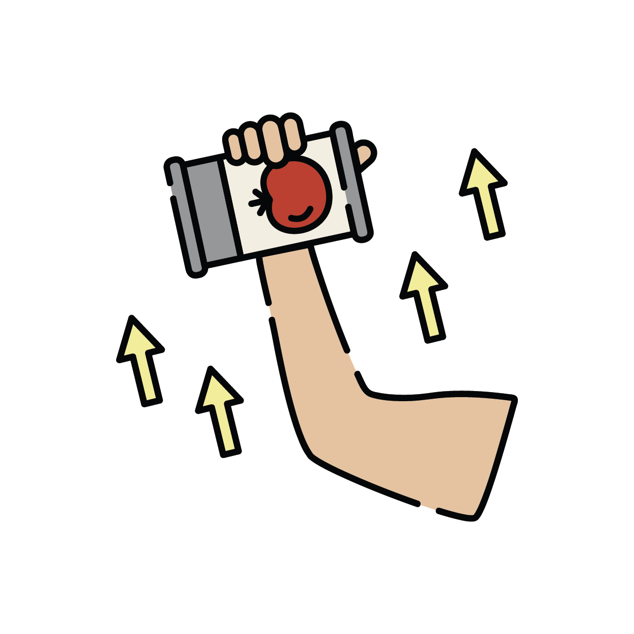
Can Exercise
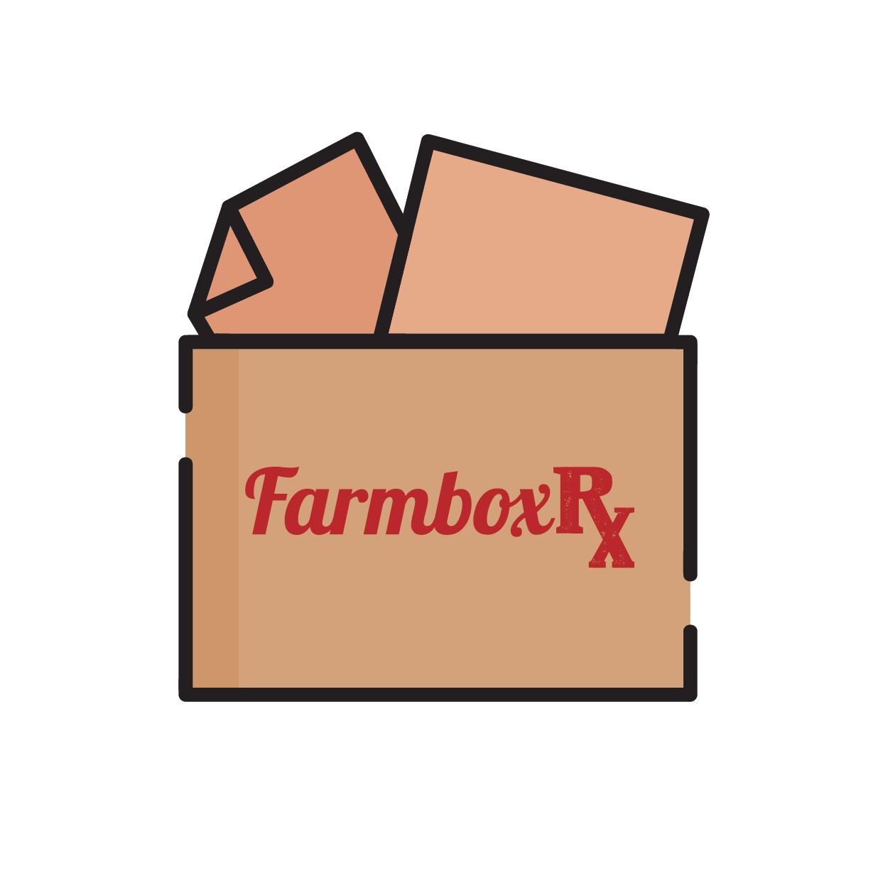
FRx Box

Box Liner

Ice Pack
Applied Icons
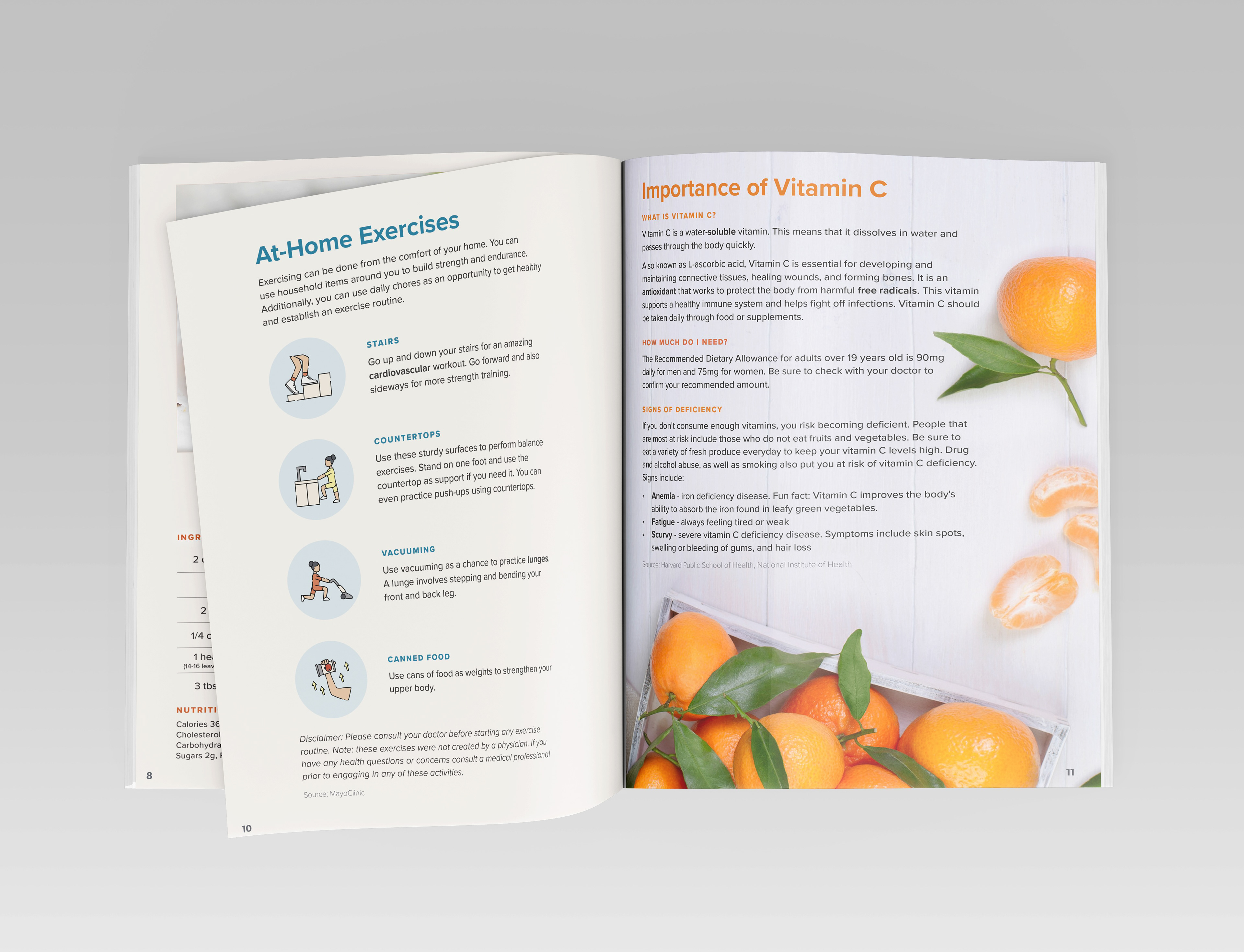
Exercise icons featured in FarmboxRx magazine spread.
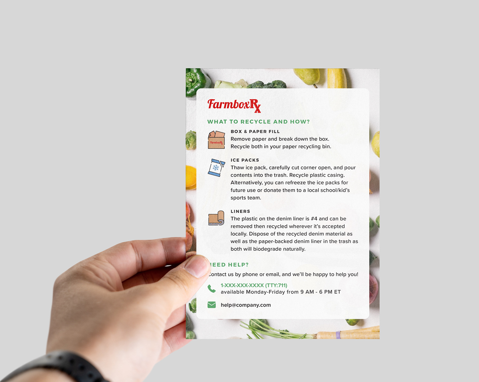
Recycling icons designed for sustainability insert.
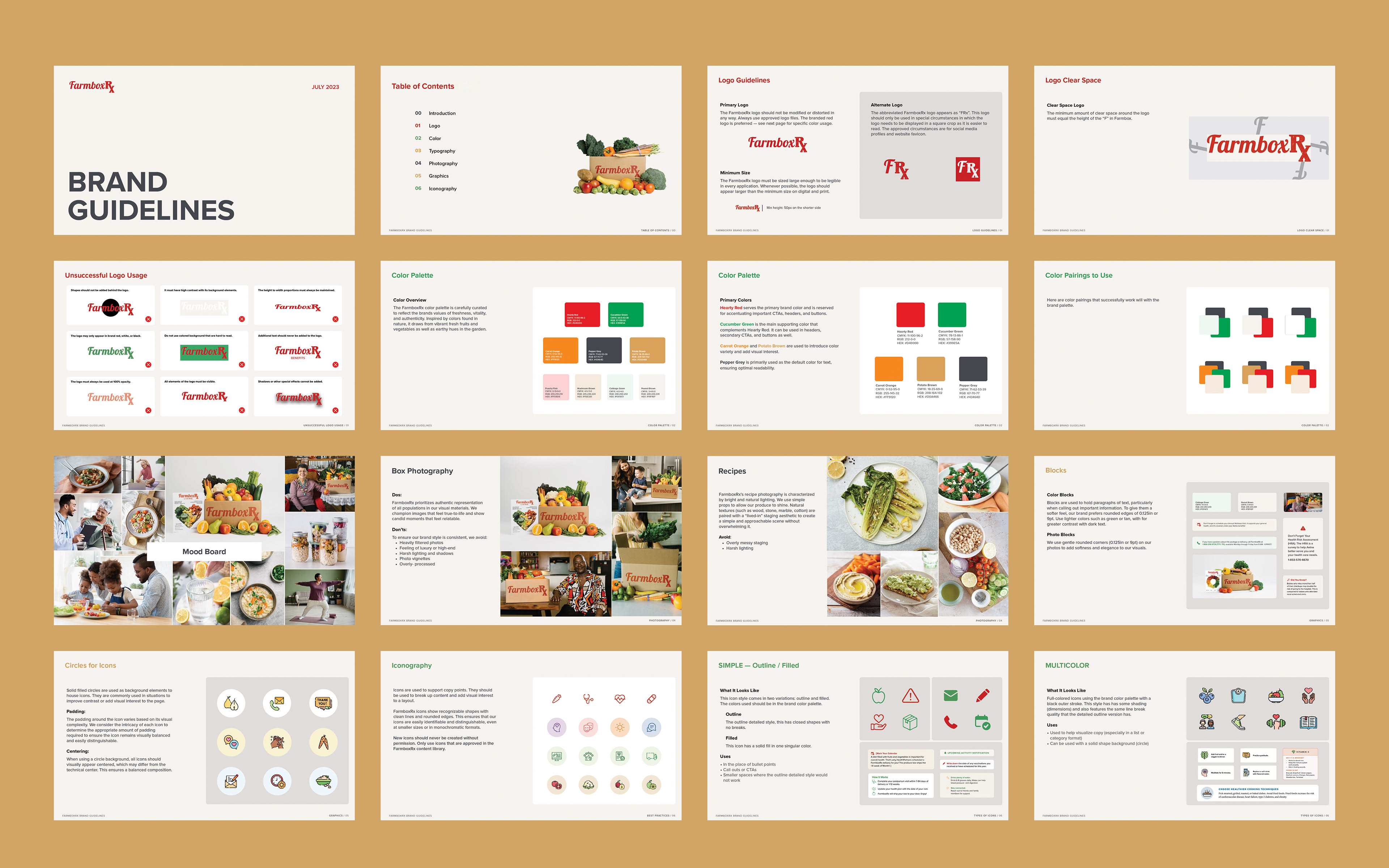
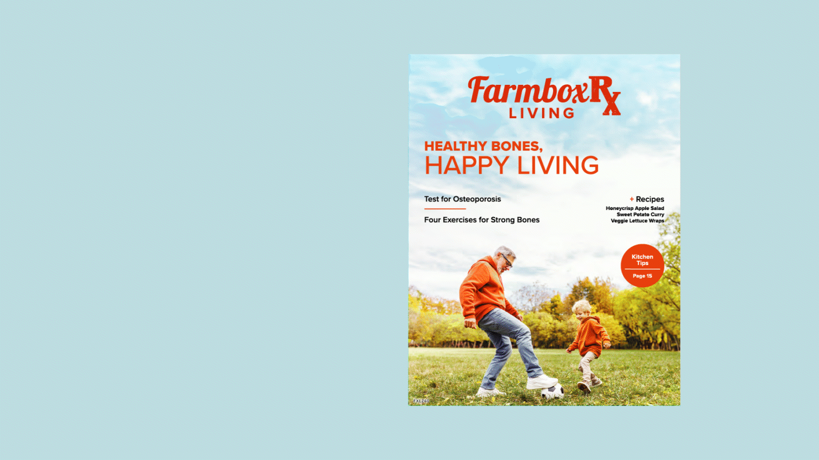
Print Communications
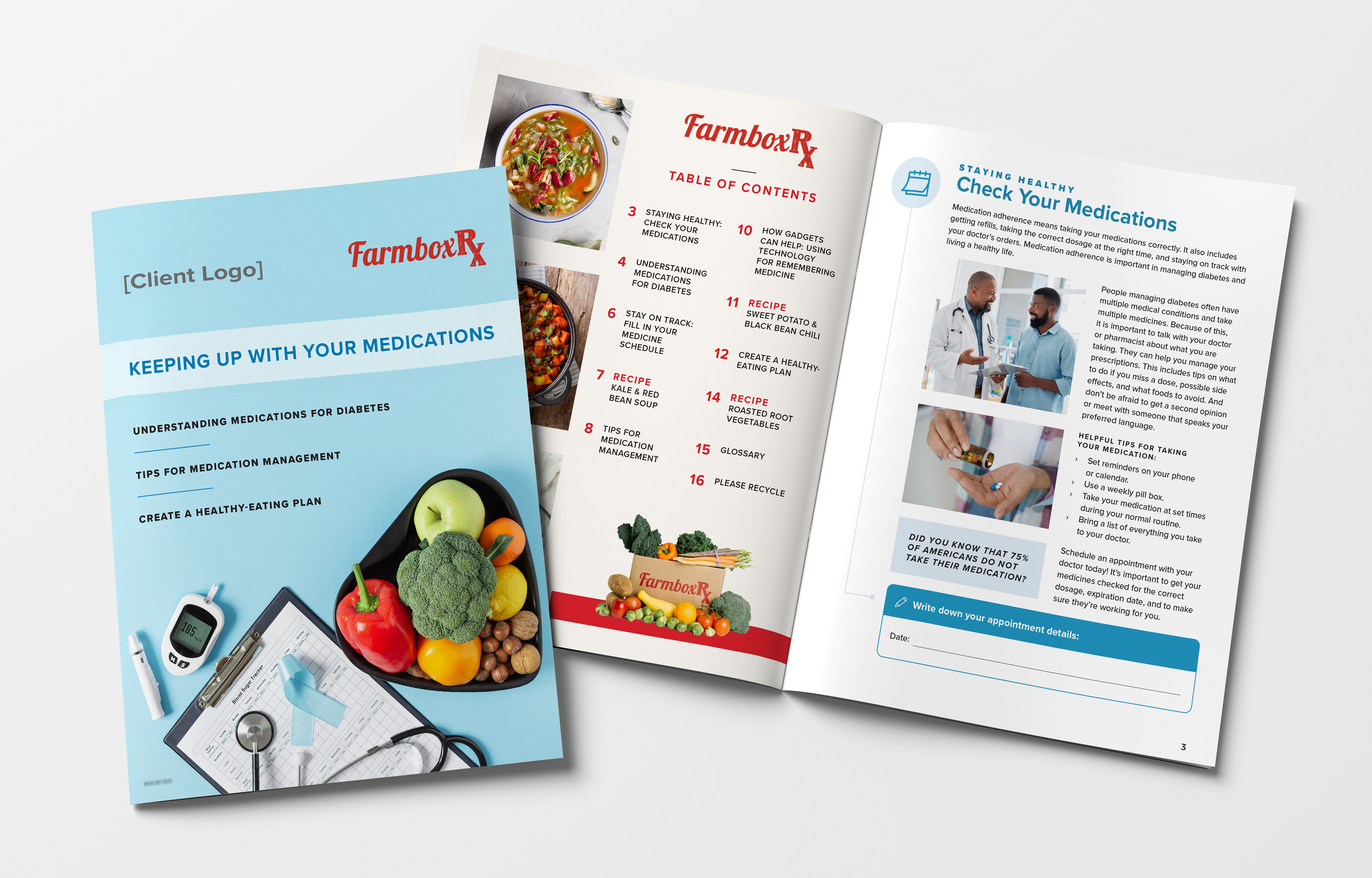
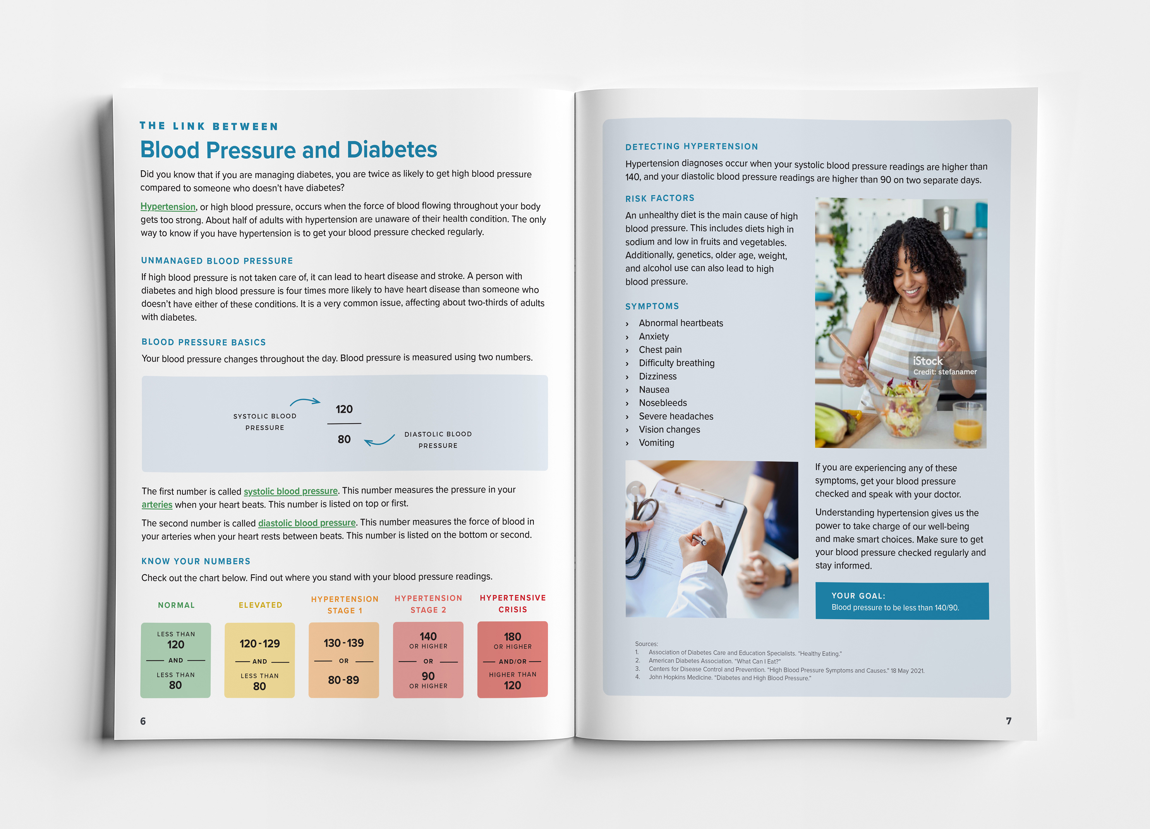
I took full creative ownership of the FarmboxRx magazine, overseeing design, layout, and consistency across issues. Each issue of FarmboxRx Living focused on accessible health and nutrition education. I developed layouts for features, recipes, and wellness content, ensuring clarity, visual balance, and alignment with the brand’s mission.
Nationwide Magazine
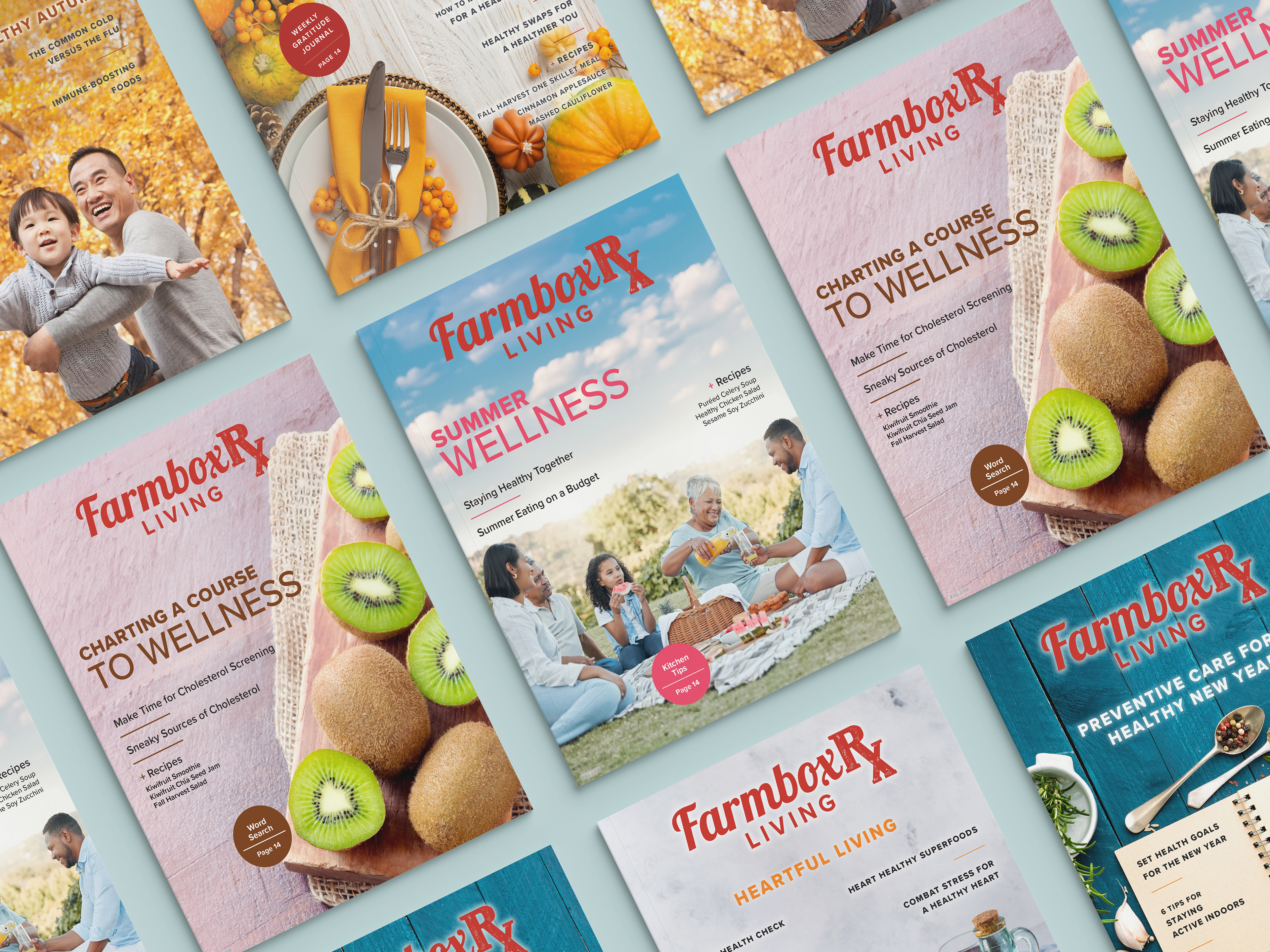
Each issue of FarmboxRx Living was designed to translate health education into approachable, visually engaging stories—spanning nutrition, wellness, and preventive care.
Health Education Booklets
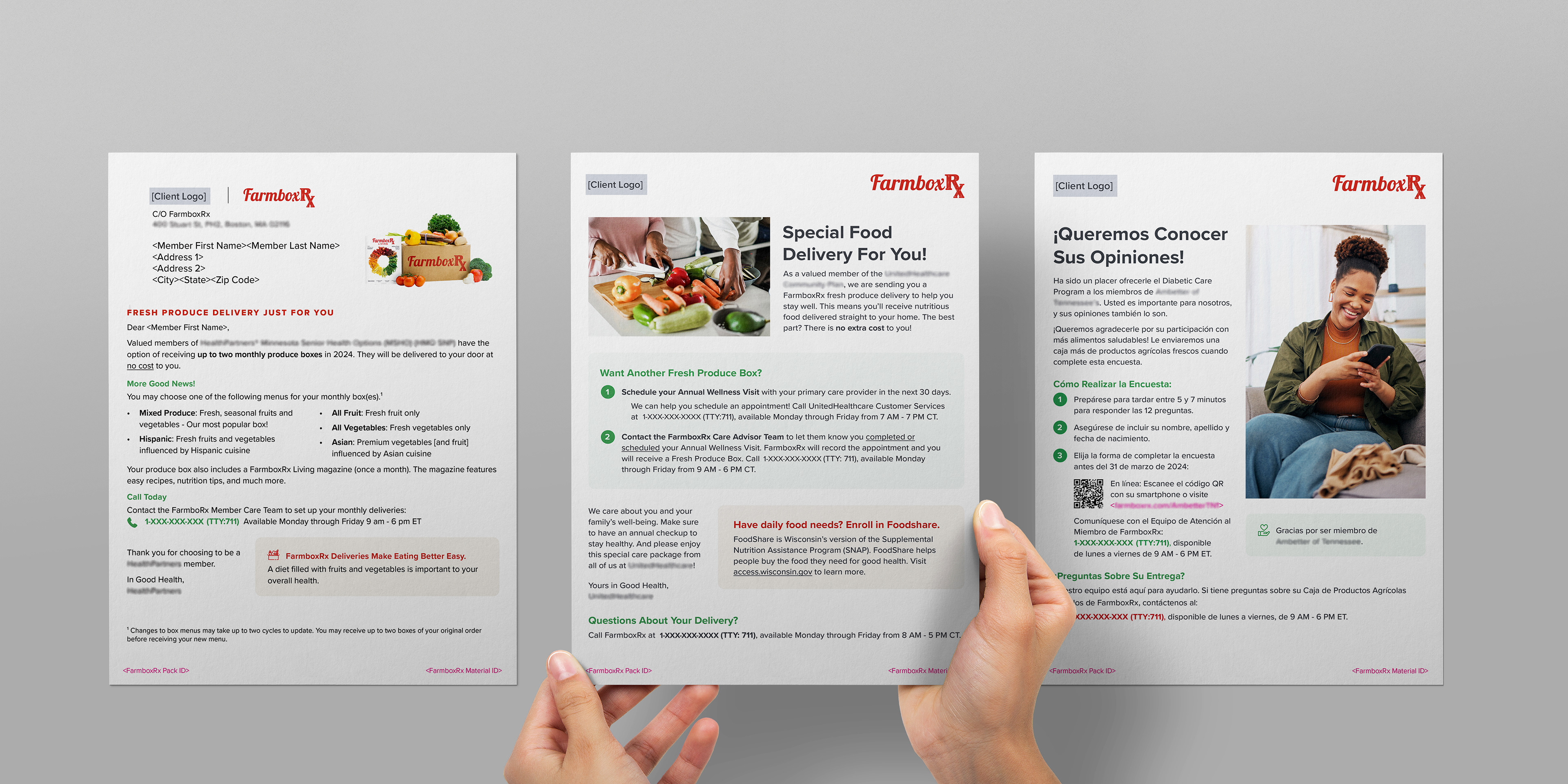
Targeted Flyers & Member Letters
Flyers and member letters supported community engagement and health initiatives with concise, approachable messaging. Whether encouraging regular checkups, promoting active lifestyles, or sharing program details, these materials were designed to be visually direct and easy to digest. A large portion of these pieces were also translated into Spanish, ensuring inclusivity across diverse member populations.