
Logo Design
The ReCharg logo captures the brand’s mission to transform discarded technology into something new and powerful. Its deconstructed letterforms represent the process of disassembly and reconstruction, mirroring how ReCharg repurposes old smartphones into solar chargers. The clean, geometric structure reflects both technological precision and sustainability through simplicity, while the angular cuts symbolize the idea of energy transfer and forward motion.
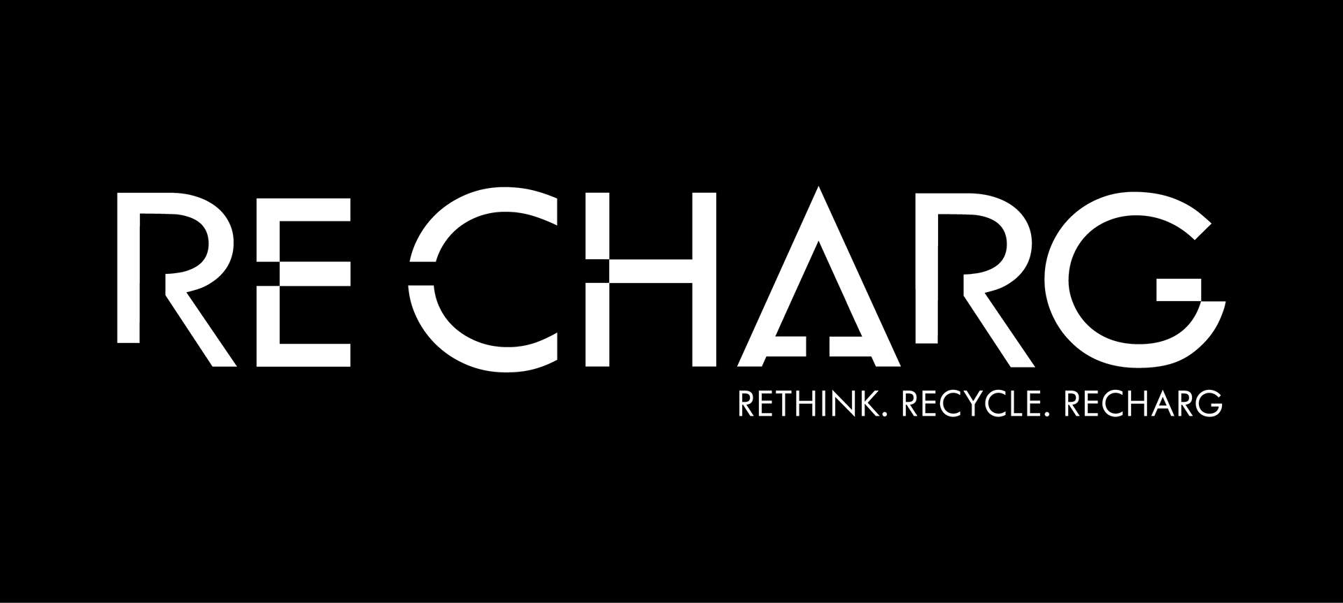
The secondary tagline — ReThink. ReCycle. ReCharg. — reinforces the brand’s cycle of innovation and environmental responsibility. Together, these elements communicate a future-forward identity rooted in purpose and transformation.
Advertising Campaign & Launch Party Invitations
ReCharg’s advertising campaign and launch events were designed to reflect the culture, pace, and sustainability values of each city. Each campaign translated the brand’s mission — ReThink. ReCycle. ReCharg. — into a visual language that resonates locally, connecting people to technology and renewal through design.
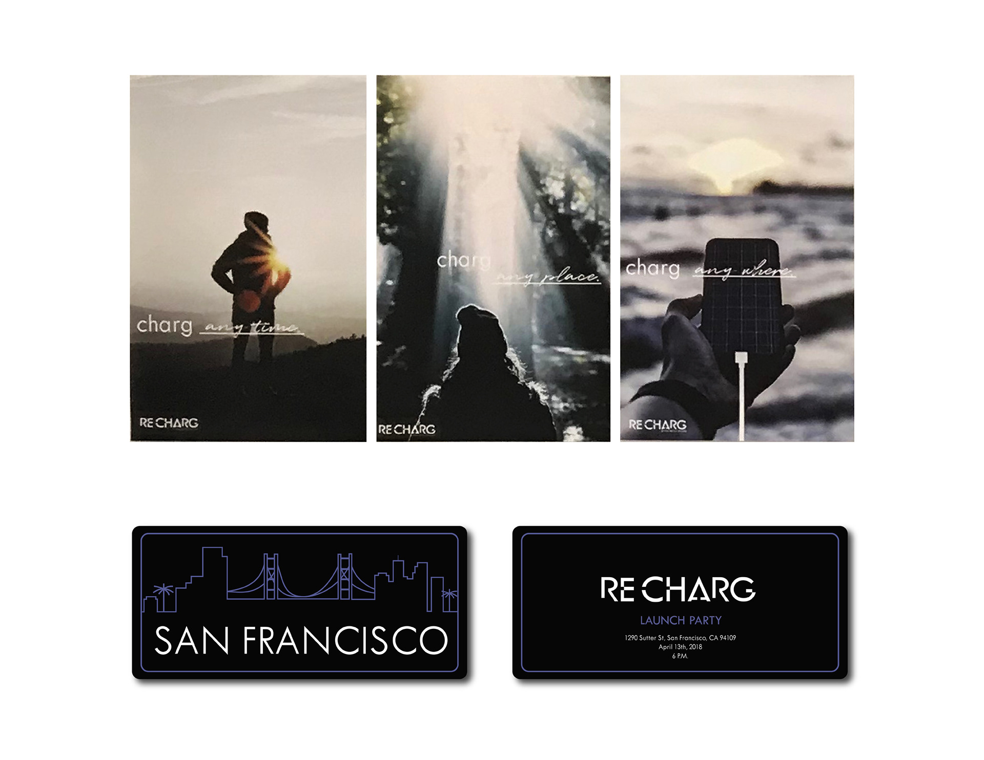
San Francisco
The San Francisco campaign emphasized athleticism and nature, inspired by the city’s active lifestyle and scenic landscapes. Sunlight and open-air imagery highlight the freedom of sustainable energy, reinforcing the idea of staying connected anywhere, anytime.
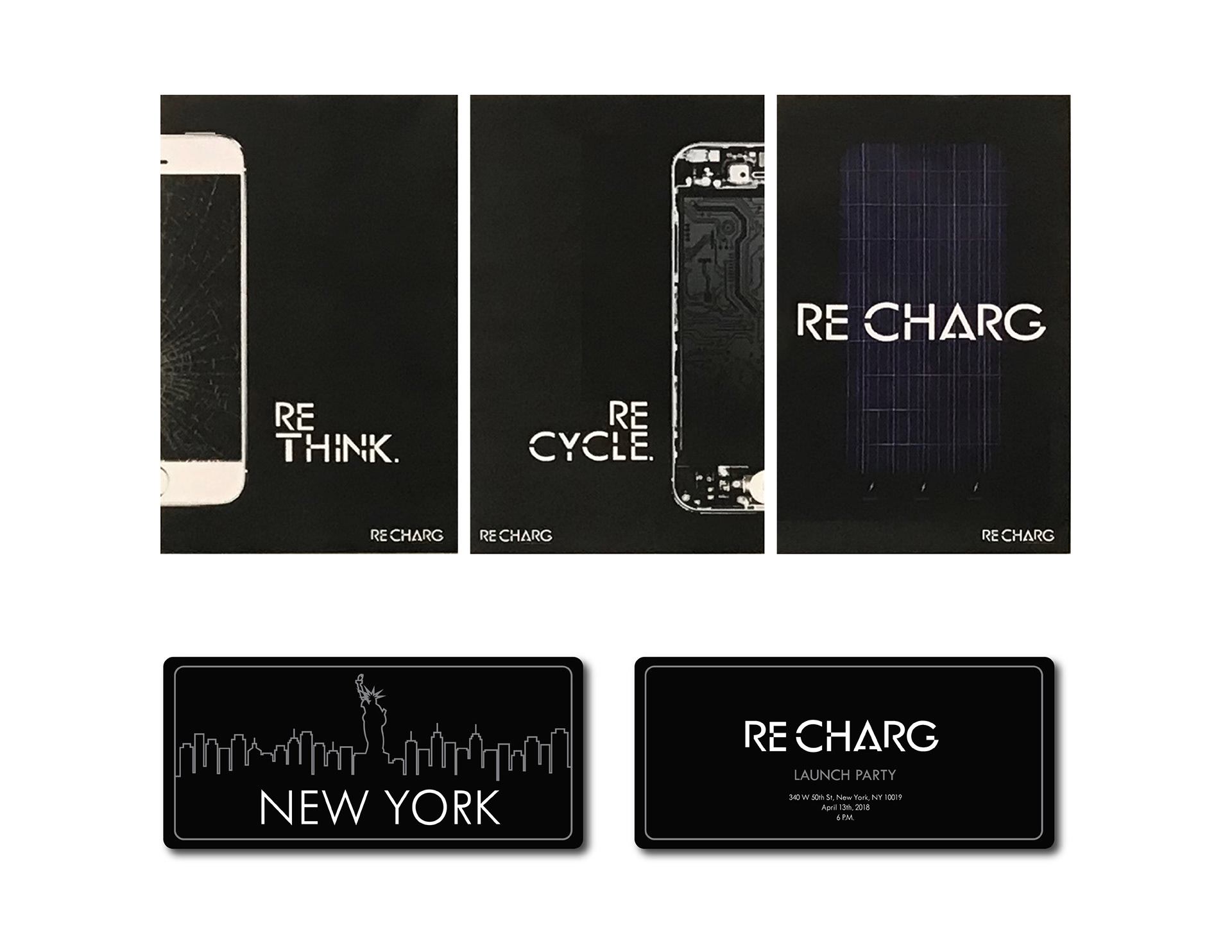
New York
For New York, the approach was bold and straightforward, using real photography and minimal compositions to mirror the city’s dynamic rhythm and on-the-go attitude. The design reflects movement, momentum, and modern efficiency — core traits of both the city and the brand.
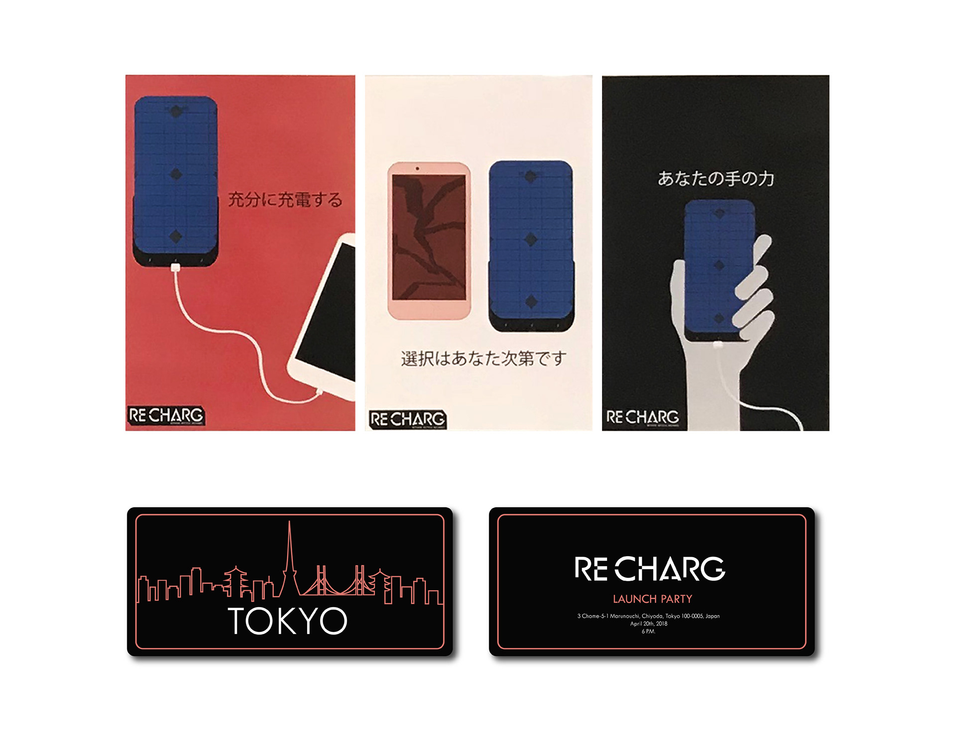
Tokyo
Tokyo’s campaign took a creative and artistic direction, inspired by anime and pop-culture minimalism. Simplified forms, flat colors, and playful contrasts create an engaging visual narrative that celebrates innovation and cultural identity..
Each campaign culminated in a city-specific launch event, celebrating the intersection of technology, sustainability, and culture. Together, these campaigns demonstrate how ReCharg’s visual identity adapts across diverse audiences while staying true to its mission of renewal and environmental innovation.